The Philadelphia Museum of Art, 1, 2, & 3: photos by Malcolm Aslett
|
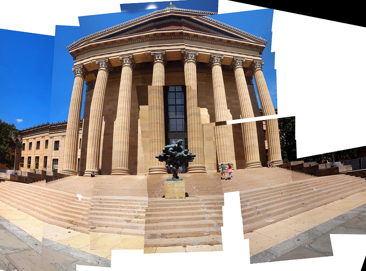
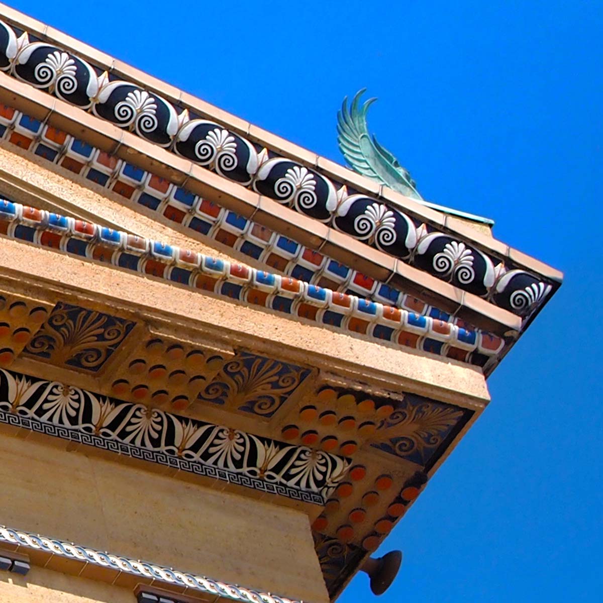
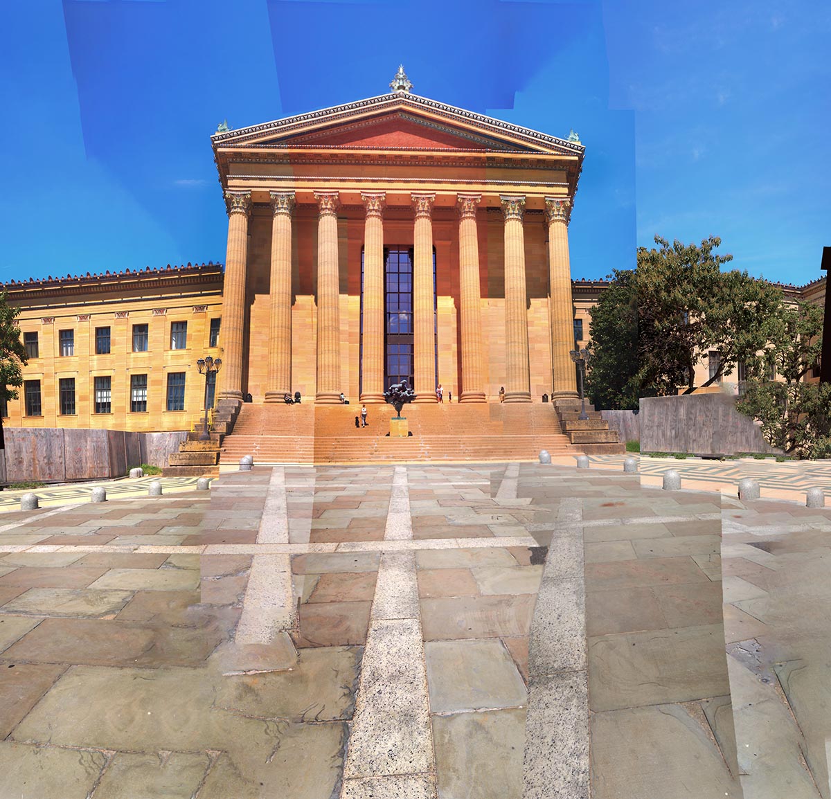
The Philadelphia Museum of Art really takes itself seriously as a temple of Art. Lots of art, and, as you can see, it is also very 'templey'. Here are three takes of several constructions I made. The one above is the easiest on the eye, a panoramic view that gets that batwing shape partly through taking the sequential images with the lens closer to a wide angle setting. (The old manner of talking about 50mm and 18mm lenses seems to be on the skids due to the technological transformations in camera making). I took out a few of the tourists cluttering up things. The facade is in sunshine where it counts and the shadowed wings help to frame the main subject. Looks a great and inviting place to visit, right? And it is that. A world class collection of art - though they could perhaps rethink using paper cups for the coffee. There are some things it doesn't pay to skimp on. I took my images from several viewpoints and varying distances from the face. I play about with them in common ways now as I do like to try to work on those pillars to look vertical in at least one version and to achieve that I move across the face parallel and take images looking square on. Number two, directly below, shows some evidence of this to the visual detective by indications in the paving coming towards you. I placed myself at the head of several parallel sections and took the photos top to bottom, almost to my feet. So the lines you see coming towards you at the bottom are some distance apart in reality and would never come near to coming to a point in Euclidian space. The third image was constructed in sections to begin with and then plopped together. I haven't got around to working on 'finishing' it as I want to mull over what overall shape I want to go for. In its present state it is rather destructive, breaking open the absolute classical order, shattering the pediment into shards and leaving pillars and steps with gaps that affect some spectators in an irritating fashion - incomplete doesn't need to be the same as 'unfinished', as I've tried to argue in the past, but for an initial viewing these gaps represent a rebuke to our need for unity in form. The bottom image is a detail of the building which is not apparent in these small versions. There has been a great deal of care put into the smallest parts of the surface by the builders even though most visitors are never likely to see them or take note. You might know there are historical arguments for finishing the parts that no one will ever see in a work. These might be religious (as in 'God or the Gods can see everything, even the backside of a sculpture, so make sure it is completed as if a deity is your audience.) or aesthetic (if your aspiration is for something perfect you don't avoid doing something because only you will know it was done at all). There's a book idea. Art forever hidden. Might put some more up when I get them done. |
|
 |
 |


